
There’s a good chance – 65% in fact – that you are a visual learner. I personally put myself in this category. Rather than reading text or listening to instructions, I always perform better and remember more through visual aids, especially on a subject I’m not familiar with.
Numerous research studies back up my personal experience…
When it comes to comprehending information for example, the brain processes visuals an astounding 60,000 times faster than text according to the Visual Teaching Alliance. And as for retention, the Office of Training and Education at the U.S. Occupational Health and Safety Administration (OSHA) explains:
…retention of information three days after a meeting or other event is six times greater when information is presented by visual and oral means than when the information is presented by the spoken word alone.
Suffice it to say that considering my own experience and the research, it’s easy to see why visual aids have been a staple in academics and business for decades.
Risk management is no exception…
When it comes to understanding the impact of risks to objectives, visual aids can be especially helpful for prompting discussions.
Earlier this year, I provided some helpful tips on creating ERM presentations that make an impact (no pun intended) for risk management discussions. Well, this time I want to discuss a specific kind of visual aid that I have found to be helpful in certain conversations – radar charts. These charts frequently get overlooked in Excel in favor of pie charts, bar charts, and line graphs, but they have a definite use.
Radar charts are one way for comparing results of risk assessment to the organization’s risk tolerance so decision-makers can easily comprehend how a particular risk will impact an objective. The chart essentially compares one set of data on a risk’s impact across different categories such as legal, reputation, operations, or any other parameters your company would like to set.
Since we’re talking about “visual aids,” here’s a sample radar chart that examines different scenarios in connection to a particular objective.
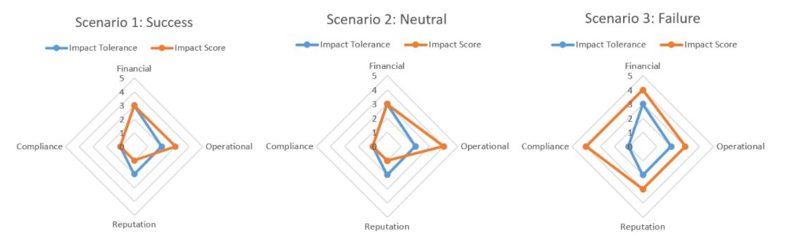
It’s important to understand that radar charts are not simply a visual representation of a stand-alone risk – you don’t want to say “here’s a radar chart for risk A” since one risk may be acceptable, but others may not. Instead, there is one radar chart for each objective. One data series contains the organization’s risk tolerance by category while another represents the risk’s impact by category. And don’t feel constrained to just two data series – include all of the risks associated with an objective. Simply use a different color for each risk.
The point: all risks are linked to an objective, but now you need to discuss which risks are outside of the tolerance.
Take Scenario 1 as an example.
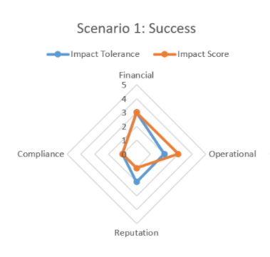
As we can easily see, the risk impact for the financial and compliance categories is exactly at the risk tolerance. Reputation comes in slightly under while the operational category is slightly above the tolerance.
Having this information available at-a-glance as opposed to a written report can be extremely helpful for prompting a deeper dive by both risk management and executive decision-makers. While it appears the proper amount of risk in the financial and compliance category is being taken, decisions will need to be made on reputation and operational. Impacts that fall below the tolerance could mean that either not enough risk is being taken or the risk is being over-managed.
Some questions the radar chart may prompt include:
- Why is this over/under our tolerance level?
- What can we do about it?
- If we can mitigate, does it make the risk acceptable to the company in order to achieve this objective?
- Is the objective worth the additional risk? Or should we modify, delay, or abandon the objective?
- Can we change any processes to bring the risk within the tolerance?
The point of the radar chart isn’t to make the decision, but rather provide an easy to comprehend visual so decision-makers can better understand any adjustments they may need to make.
Where do the numbers for risk impact and tolerance come from?
Creating these convenient visual aids for ensuring risk-informed decision-making does require a little prep work. The figures you see plotted above are not pulled out of thin air.
Let’s start with risk tolerance…
As I explain in a previous article, risk assessment results alone are not enough to prompt action. The company as a whole needs to understand the level of risk executives and the Board are willing to accept in pursuit of strategic objectives; hence, the need for risk tolerance. Without it, a radar chart will be nothing more than just some data points plotted on a pretty chart.
Besides risk tolerance, the methods for assessing and scoring a risk impact will need to be determined as well. Will descriptive elements be used to rank a particular risk (i.e. qualitative) or hard numbers like losses, fines, or number of safety incidents (i.e. quantitative)?
Each approach has its plusses and minuses…
A qualitative-based approach is much easier to get off the ground, especially if your company does not have robust data analysis or modeling capabilities. However, it can be very subjective (biased) if not done properly and only shows a single point of impact.
Quantitative on the other hand is more unbiased (…at least theoretically) and can show a range of impacts. However, it can also be overwhelming for unprepared companies, possibly leading to frustration, wasted resources, or even worse, so it must be approached with caution.
In some cases, it’s possible to mesh the two. A “10% defect rate” could be listed as a severe impact, thus making a statistic a part of the assessment process. It is always nice to have stepping stones for companies that have some data but not enough for “true“ quantitative risk assessments.
As I can attest from personal experience, visual aids are valuable tools for comprehending and remembering complex subjects when used effectively.
What other types of visual aids can be helpful for understanding the impact of risks to objectives and improving decision-making?
To share your examples or thoughts, please don’t hesitate to join the conversation on LinkedIn.
My upcoming eBook on integrating risk into strategic decision-making will dive more into ways for understanding risks to objectives…so be on the lookout!
In the meantime, if you are struggling to develop visual aids like radar charts for helping executives better comprehend risk information for decision-making purposes, please feel free to contact me to discuss your situation and possible solutions today!