Something I have come to appreciate in recent years, and backed by research coincidentally, is how watching a familiar TV show or movie can be a great stress reliever. Familiar plot lines mean our brains don’t have to work very hard, which can be a welcome relief after a hectic week.
I could list several TV shows and movies I find enjoyable, but one of my favorites is the action-thriller Basic starring Samuel L. Jackson and John Travolta.
I won’t spoil much in case you’ve never seen it, but there’s one recurring line in it that ties in nicely with today’s topic, and that is:
You’ve got to tell the story right.
There are so many directions I could take that statement, but in the context of today’s article, it means communicating risk information in a way that enables proper decision-making.
For years and years, risk matrices or heat maps have been the go-to tool for communicating this information, but for reasons that should hopefully become clear as we go along, they don’t exactly tell the story right.
Like risk appetite, the subject of heat maps garners much controversy.
In a previous article on creating risk visualizations, I not only briefly describe the limitations of heat maps, but also how decision makers need to know the kind of impact risk(s) will have on an objective and how certain we risk professionals are that this could happen.
Unfortunately, in spite of their continued popularity, heat maps are unable to do this.
Concern #1: Manage to Green Syndrome
One of the reasons, in my experience, is a mentality that arises out of using the standard colors you see on a heat map, notably Red, Amber, Green, or RAG. Inevitably, when showing one to decision-makers, the automatic assumption is we need to get every risk down to green. (This is this behavior that I call “Manage to Green” syndrome.)
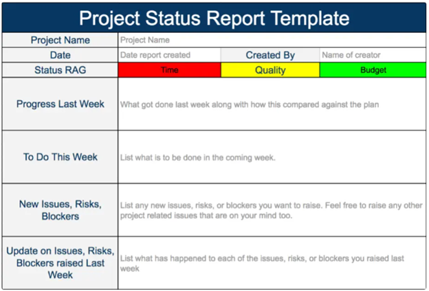
Doing so may make sense if this color-coding is referring to a project status (like the image shown below) or similar activities, but definitely not risks.
But here’s the fatal flaw of the RAG approach…
When it comes to risks to strategic objectives, you don’t want to get every risk down to green.
Doing so would be counterproductive at best or downright destructive at worst for two reasons:
- Companies must take risks to be successful, and…
- Any company who tries to manage every risk down to a green or some other metric will simply manage themselves right out of business.
The goal of ERM isn’t to eliminate every risk, but rather to provide valuable insights so management can make informed decisions about which risks to reduce, leave as-is, or take in pursuit of strategic or business objectives.
Concern #2: Inaccurate Worst-Case Scenario
Another concern I have about heat maps is the mismatch that often occurs between likelihood and impact. Risks shown on a heat map typically represent the worst of all worst-case scenarios. This of course is inaccurate as there is always a range of possibilities.
The heat map doesn’t allow you to separate and show multiple variables – a risk could have a big impact but a low chance of occurring, or it could have a smaller impact but a high chance of occurring.
Using a heat map to tell this kind of complex story is incredibly difficult, if not impossible.
Like our movie line – “You’ve got to tell the story right” – any visuals or risk reports must communicate risks and opportunities in a way that’s easy to understand and, more importantly, accurately reflects reality.
I’m not the only one to point out the heat map’s limitations…
Since they are based on subjective, qualitative measures, Hans Læssøe believes heat maps are beyond useless as he puts it. He explains in his commentary on the subject that placing any one risk in a “cell” ignores that it may have any level of outcome that often is not directly related to likelihood.
Graeme Keith doesn’t hate heat maps, they just make him sad.  Graeme helps companies use mathematical (quantitative) models to better manage risks and pursue strategic objectives. He eloquently explains why heat maps make him sad in this LinkedIn post where he states:
All the hours wasted wrangling about whether an impact should be a 3 or a 4, bickering about how bad it could get, how bad it’s been, trying to remember whether to assign worst case or some kind of broadly illustrative case and whether the likelihood score pertains to wherever the impact finally lands or to the occurrence of the risk more broadly.
All that conscientious labor, looking back over past occurrences, maybe gathering industry data, only to hurl all that potential insight into a tool that can do nothing with it, just sorts it, like laundry into one of a small number of colored baskets.
Graeme sure has a way with words!!
He goes on to explain that despite the effort that goes into putting them together, heat maps are unable to answer basic questions about how much a risk is costing the company, how much it’s worth spending to reduce it, or how much the company can reduce exposure without additional spending.
Does this mean heat maps are totally useless and should be scraped?
In many (if not most) cases, I personally would say yes, and I’m confident Hans, Graeme, and others would agree.
However, there are others who caution against throwing the baby out with the bath water.
Much of the positive commentary about heat maps focuses on the fact that they can be useful conversation starters.
Warren Black believes the Red, Amber, Green color coding is the most universally accepted, instantly understood symbols for showing the differences between safe, warning, and danger.
Instead of throwing them out, why not find a better way to use it? He explains the benefit of doing so this way:
Heat maps are not perfect, and are indeed simplistic, but sometimes a single good picture is worth a thousand words.
Warren makes a fair point about having a simple picture; however, I still struggle with the heat map being overly relied upon as the only visual that is used to talk about risks.
Julian Talbot also acknowledges heat maps are inherently flawed as risks are rarely capable of generating one single consequence. However, he points out that people are familiar with them, and they can at least facilitate conversations or otherwise be used as a starting point.
Again, I can see where Julian is coming from, which leads us to…
How can a heat map be used in a way that provides accurate insights about risk to decision-makers?
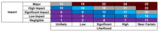
Personally, my first condition to me being okay with using heat maps is: do not use the RAG color coding. I’ve seen too many instances where executives will literally obsess about getting every risk to green.
Although Warren is correct as to RAG’s universal recognition, I feel it’s not appropriate for the type of strategic risks we’re talking about. With different color schemes like purple, blue, navy blue, turquoise, gray, and maroon, there may still be the urge to manage the risk down, but it’s not instinctual like it is for RAG. Think of the different colors as ways of grouping the risks into “this specific risk is acceptable” versus “this specific risk is beyond our risk tolerance and needs attention.”
Here is what it could look like…
Another condition to using a heat map is making sure that impact and likelihood are asked in that order because flip-flopping it makes it too complex of a conversation to have. Assuming two things: 1) you are using my preferred method of current state and target state instead of inherent/residual and 2) you are using more qualitative measures instead of real data, the conversation should go something like this:
What type of impact do you think this risk would have on the company? Okay – so it would land in the People category, specifically employee engagement. Using the criteria on the rating scale you have, where within the criteria will the impact fall today with the activities currently in place to address this risk? Got it – it would be a “2” out of 5. Now, keeping that impact level in mind, what is the probability of that impact occurring in the next 36 months? Less than 50%? Would you say close to 50% or significantly lower than 50%? Got it – it would be about 35% (1 in 3) chances of occurring.
Asking about these parameters in this way during the risk assessment will enable you to see how risks are relative to or compare to one another.
With these two conditions in place, it is a mildly acceptable use of a heat map in my view. However, I still believe it shouldn’t be the go-to as there are other, better options for accomplishing the same thing.
One example is a scatter graph… Here is a modified version put into a bubble chart where the bubbles represented risk categories and the bubble size indicated how many risks were on the categories.
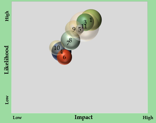
You don’t have to use grids or colors, but rather plot the impact and likelihood on an Excel chart and see where risks fall relative to each other.
However, if your company has used heat maps in the past and has a certain level of comfort with them, it may be best to use them for, as Julian says, a conversation starter.
But to not fall into a trap and waste time and resources, there must be an acknowledgement of heatmap limitations and how risk reporting must adapt to meet the company’s needs.
Does your company use heat maps to communicate risk information? What adaptations or alternatives to the heat map would you suggest?
We’re interested in hearing your perspective. Since this topic is very controversial within the risk space, any commentary must be on-subject and respectful. We invite you to share your thoughts below or join the conversation on LinkedIn.
Wrapping up, communicating risk information is one of those things that’s easier said than done. If you’ve tried alternatives to the heat map and still come up short, don’t delay. Reach out to me to begin discussing your company’s current situation, what risks it needs to communicate, and best option(s) available for helping you get there.